Mastering Color Harmony in Outdoor Photography

Color Theory, Naturally

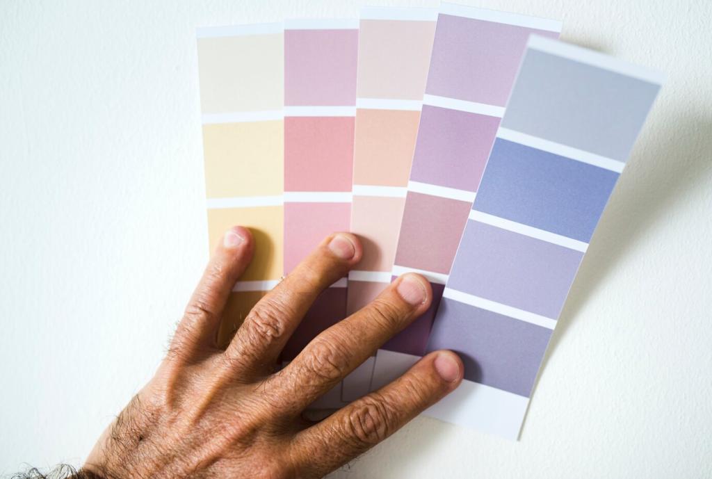
Think of the color wheel as a map for the trail ahead. Purple lupines against warm orange basalt mimic complementary contrast, while sage brush and turquoise lakes lean analogous. Notice the relationships first, then compose intentionally. Share a frame where nature handed you a perfect pair, and tell us how you framed it.

Color Theory, Naturally

Golden hour tilts scenes toward warm harmony; blue hour nudges them cool and contemplative. When light shifts, your palette changes, and so does the story. Train yourself to read temperature quickly, then align subject and background accordingly. Post your warm-versus-cool comparison and invite feedback from fellow color seekers.

Light, Weather, and Saturation

Golden Hour vs. Blue Hour Strategies

Golden hour reinforces warm complements—think amber grasses against indigo mountains. Blue hour compresses contrast, inviting subtle blues and magentas. Plan two frames of the same scene, one at each time, then compare emotional tone. Post your diptych and tell us which hour better served your subject’s story.

Overcast: Nature’s Softbox for Color

Cloud cover erases harsh highlights, letting hue and texture take center stage. Mushrooms glow, foliage deepens, and skin tones even out. Dial back saturation slightly to avoid plastic greens. Share a soft-light image where color felt honest, and ask readers which hues they’d nudge in post, if any.

After Rain: The Saturation Bonus

Wet surfaces amplify color by reducing diffuse reflections. Rocks darken, lichen pops, and trails gleam with micro-contrasts. Carry a microfiber cloth for lenses and a small towel for kneeling. Upload a rain-kissed scene and invite critiques on whether your saturation matches the memory of the moment.

Composing With Color Balance

Give one hue authority, let a second support, and reserve a small accent for spark. A vast teal glacier (dominant), muted slate cliffs (subordinate), and a crimson jacket (accent) communicate scale and human presence. Share a shot and label each role, inviting others to propose alternate balances.

Composing With Color Balance

Color needs space to resonate. A simple sky or plain sand can calm busy palettes and strengthen your subject’s hue. Resist filling every corner with detail. Post a minimalist composition and explain how empty areas amplified your main color’s emotional weight.

Camera Controls That Shape Color

Instead of auto, try setting Kelvin to steer mood—cooler for crystalline dawns, warmer for campfire evenings. Shoot a small WB bracket and see how the palette shifts. Upload your trio and ask which balance aligns with the memory you want viewers to feel.

Emotion and Story Through Palettes

Mossy greens and misty blues whisper stillness. Think secluded creeks, fog-bound ridges, and unhurried footfalls. Pair soft hues with gentle compositions to stretch breath and time. Share a calming frame and a short caption about why the scene felt restorative.

Emotion and Story Through Palettes

Rust cliffs and ember skies speak of movement and grit. Balance their power with anchored shapes—a ridge line, a road, a figure—so energy doesn’t overwhelm. Post an adventure scene and ask readers where their eye landed first and why.
Codybellec
Privacy Overview

This website uses cookies so that we can provide you with the best user experience possible. Cookie information is stored in your browser and performs functions such as recognising you when you return to our website and helping our team to understand which sections of the website you find most interesting and useful.